Orleans Smokehouse
Branding, Campaign Planning, Content Creation



Harvester, home of the iconic salad bar, is one of the UK’s most loved family restaurants. Since 1983, it has been a go-to for family meals. In 2023, CHS was appointed as lead creative agency to breathe new life into the brand, ensuring its appeal spans generations to come.
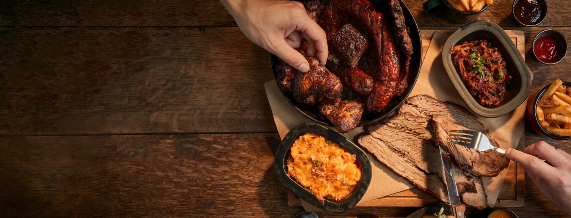
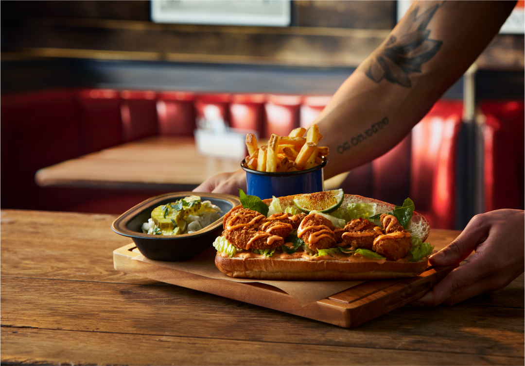
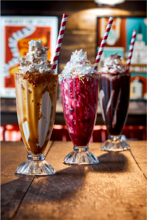
Harvester has made significant investments in ingredients, recipes, and staff training to deliver a truly unforgettable, flavour-packed experience.
However, while the food was more vibrant than ever, the visual identity needed an update to match the rich flavours and elevate the overall guest experience. But how could we refresh the brand while preserving the elements that make Harvester so recognisable and loved?
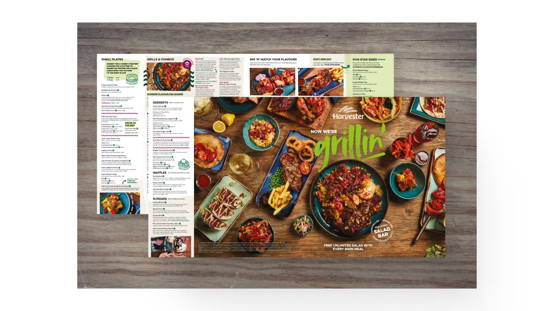
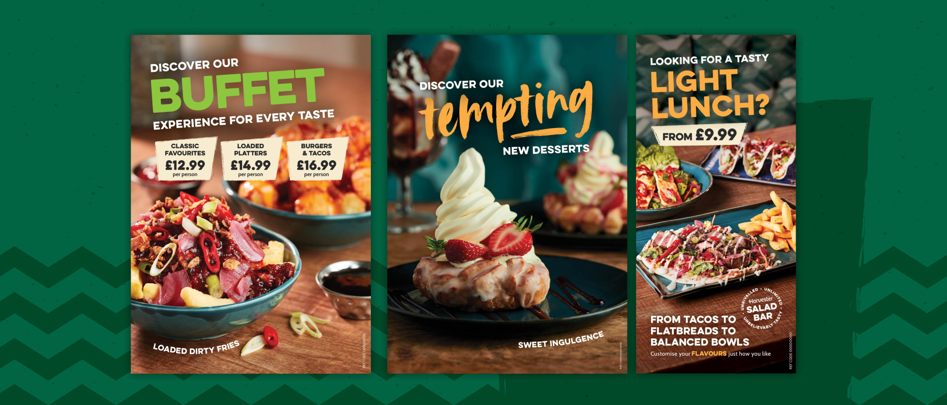
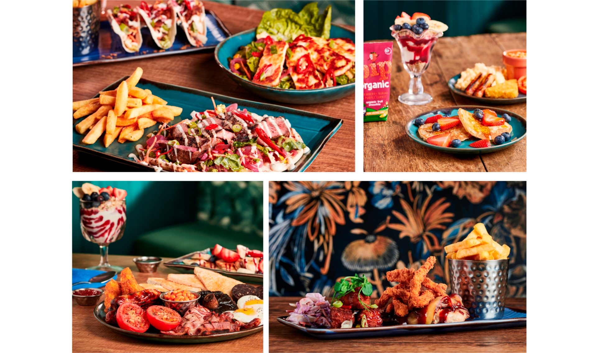
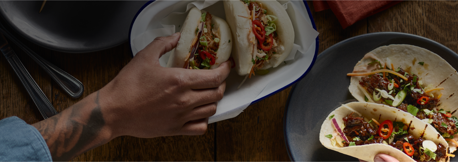
Our brand refresh brought flavour to life in every aspect - colour, movement, photography, and tone of voice. To us, flavour is more than taste; it’s a feeling. This allowed us to inject bold personality into the brand, reflecting the vibrant flavours on the plate.
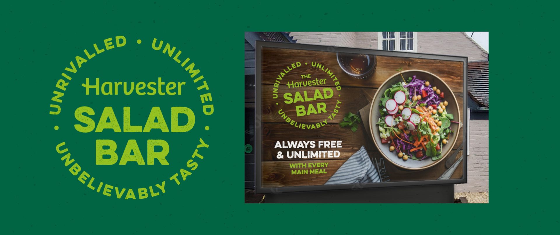
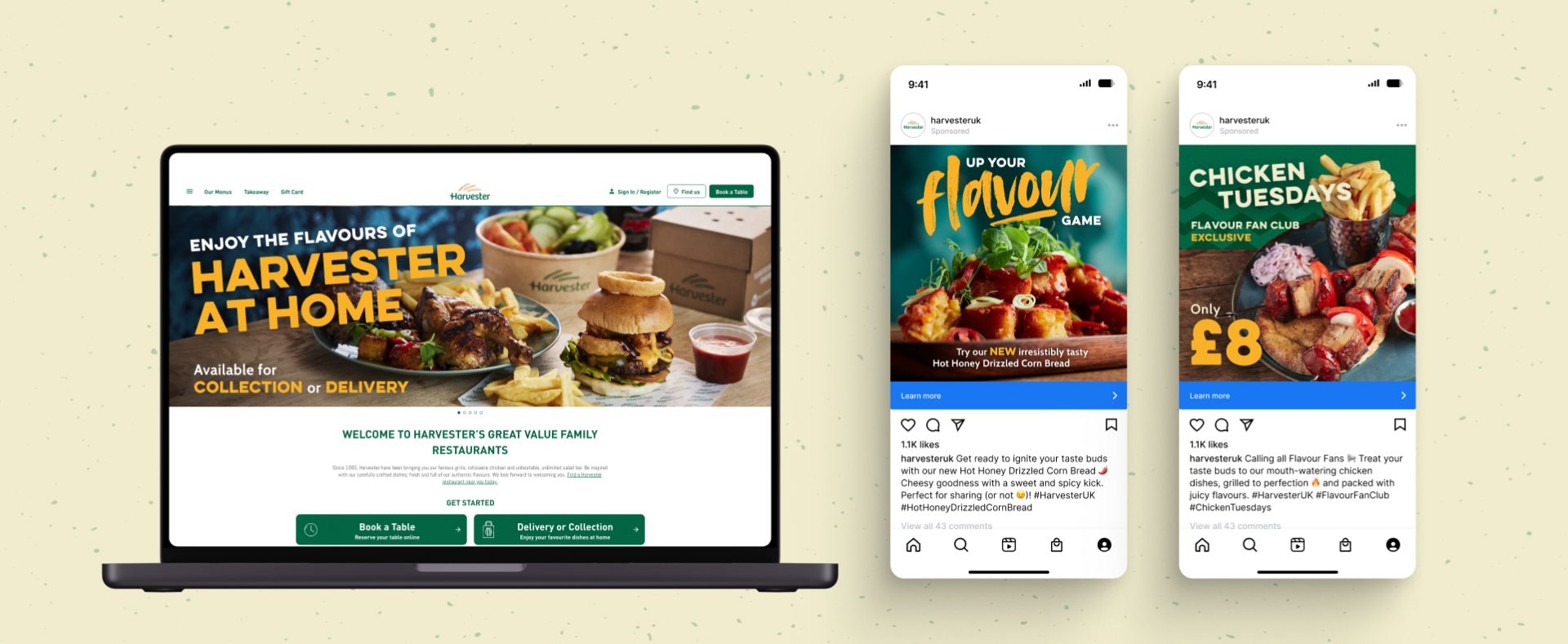
By keeping the iconic logo and signature green, we respected the brand’s heritage while propelling it into the modern day. The new visual identity rolled out across all restaurant touchpoints - from menus to signage - alongside customer communications and campaigns.
 B2B Campaign Winner 2024
 Sponsorship Winner 2022
 Best Paid Social Winner 2021
Best Use of Video Winner 2021
Best Paid Social Winner 2021
Best Use of Video Winner 2021
 Highly Commended - PMAs 2022
Best Finance Campaign 2021
Highly Commended - PMAs 2022
Best Finance Campaign 2021
 Best Financial Services Campaign Winner 2020
 Best Financial Services Campaign Winner 2020
 Rated 9.2 out of 10 from our clients
 Marks & Spencer Food Portraiture 2nd Place 2020
 Direct Marketing and Print Winner 2019
 Creativity/Innovation Winner 2018
Fancy a chat? We would love to hear from you.
hello@chs.agency